The Baltic sea washes approximately a fourth of the total border length of Latvia, however fishery is not as popular as one might assume, which is why it is valued highly, by the people living close to the sea. It takes determined people, that love and cherish their own land to choose a profession working in the sea, because it takes a lot of strength and strict work ethics, which is also very typical for the Latvian mentality.
The Borov family are people with a lot of determination and love for their land. At a time when many Latvian families were leaving Latvia, in search of a better future elsewhere, the Borov family decided to start their own business in the fish processing industry.
Boroffish is the company established by the Borov family, and they are producers of premium quality snacks prepared from cod and flounder filets, which are caught locally in the Baltic sea. The head of the family, Mr. Borov has been the captain of a fishing boat with more than 30 years of experience in this field, so he is very much aware of what the Baltic sea has to offer. After examining the offers of the local supermarkets, he determined that very few producers offer snacks prepared from locally available fish. The few producers that do offer this, are mainly offering whole, dried fish, with scales and bones. Consuming such snacks is messy and uncomfortable, which is why the Borov family decided to offer snacks that are prepared and easy to consume, from fish that are available in the local sea, highlighting how beneficial our geographical location is – and thus Boroffish was established.
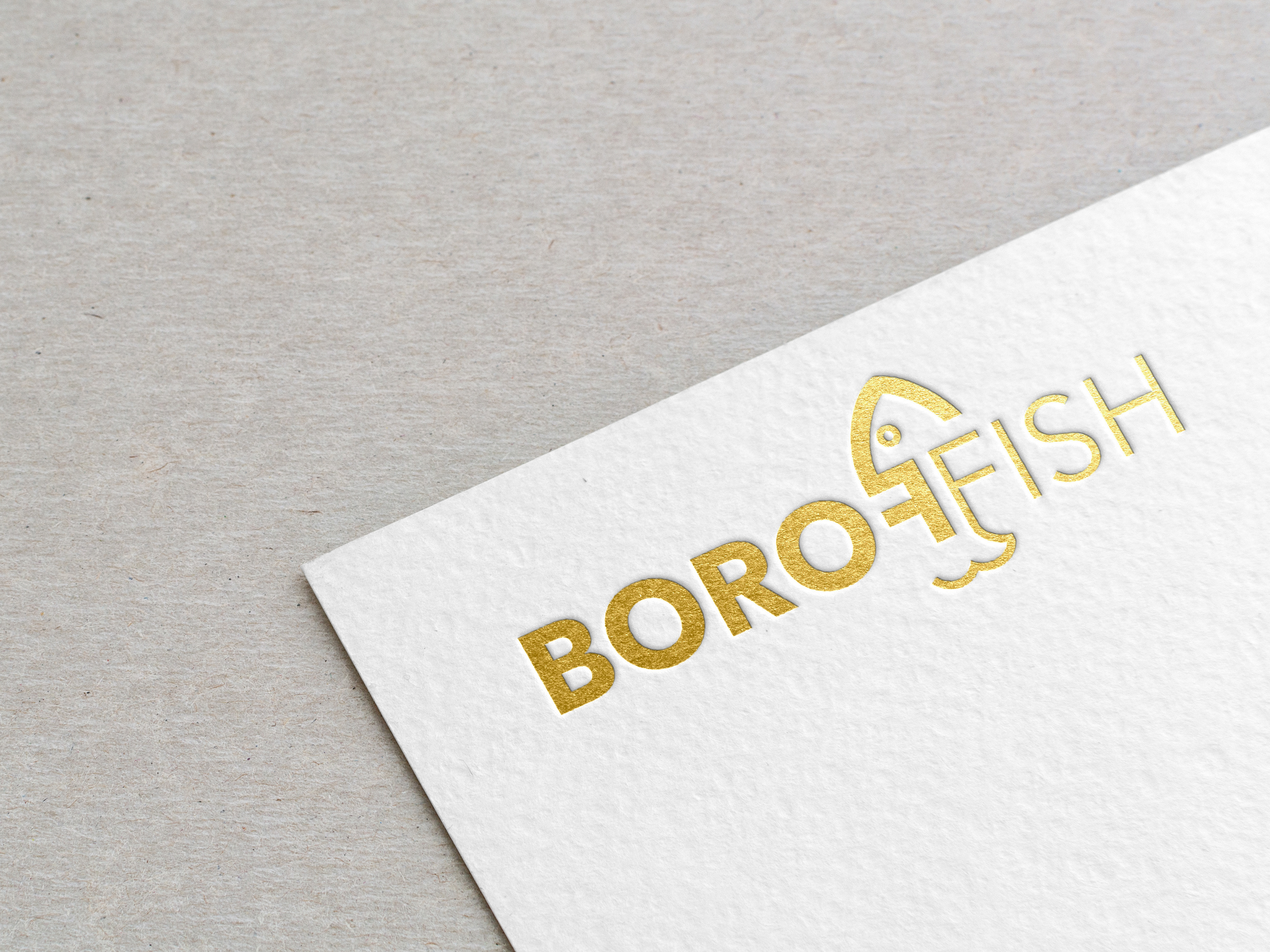
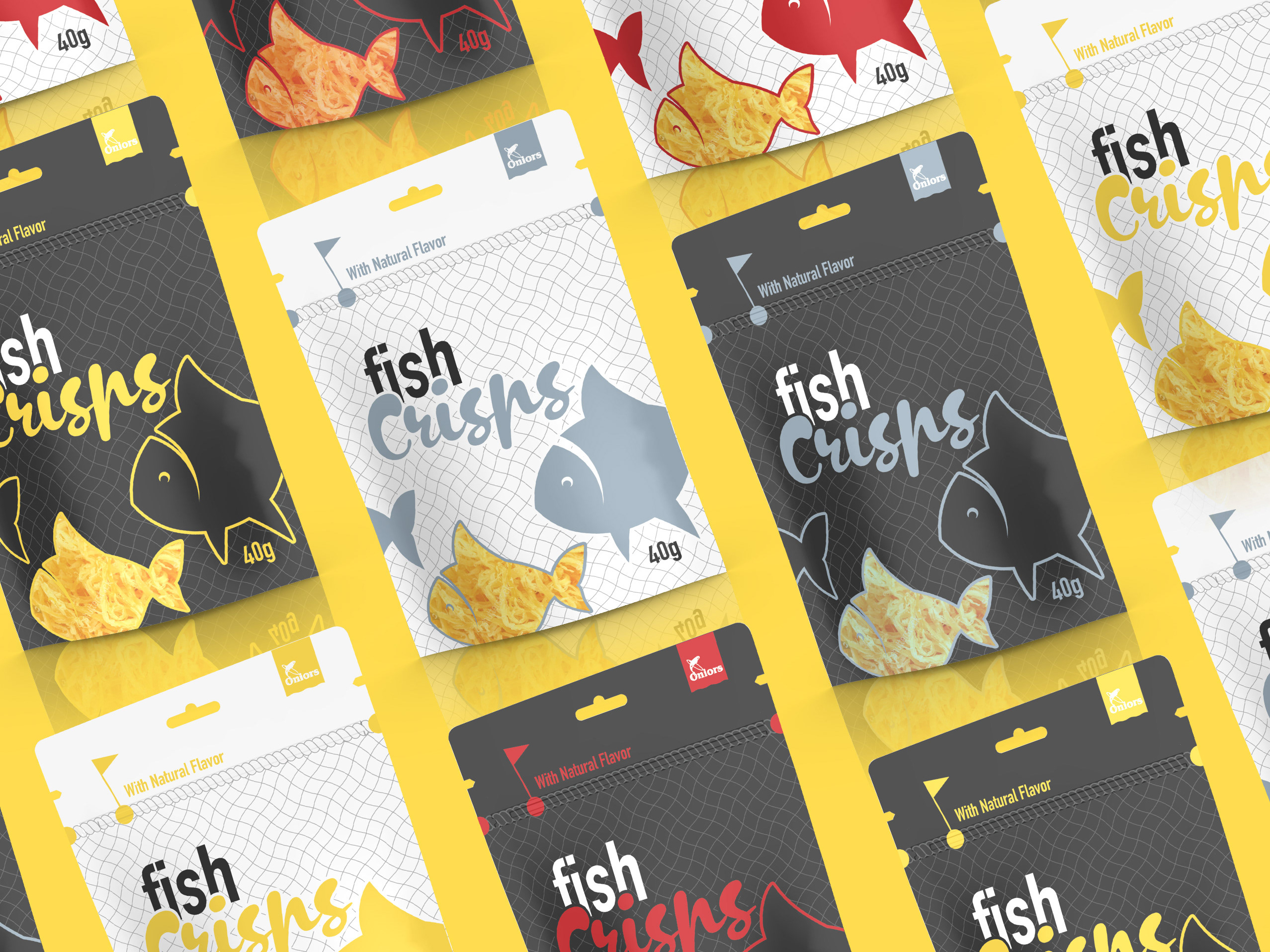
Developing the visual identity for the packages, we sought to deliver these special feelings of belonging to each consumer, which is why the resulting design is minimalistic with an unmistakable graphic message that emphasizes the love that the Borov family has for fishery and the local marine wildlife. At the same time, the laconic presentation gives the product a ‘premium’ aesthetic. The Boroffish name was established by combining the Borov family name, with a word that is very common in the fishery field, and we added this to the logo, which also included a stylized icon of a fish, to keep it straightforward.
The main inspiration for the aesthetic of the packaging was the Baltic sea with the distinctive motion and sound of its waves, combined with the feelings of peacefulness that are associated with the seaside. All of these elements are present in the design of the packaging – the brushyness of the matte finish imitates the sound of the waves, the flowing visuals imitate the motion of the sea, and the illustrations of the fish imitate the feeling of peacefulness that can be found underwater. As an additional identificator for the various tastes of the product, different colors were used to mark the packaging.
Dried fish is not only a tasty snack, it is also a healthy alternative to the multitude of junk food, as dried fish preserve all of the minerals and vitamins that fish have to offer. Additionally, only natural spices are used in the preparation process finishing it with a dash of – yup, you guessed it – sea salt!

